McMenamins
Native App Redesign
McMenamins is a chain of bars, restaurants, breweries and hotels across the PNW. They have a native mobile application that has various features to help users find the nearest McMenamins, see what’s on tap, track their McMenamins passport stamp progress, and more.
Our main goal for the project was to determine who uses this app, confirm what they use the app for most, and solve a key problem these users are facing that would help the users and the business.
Project DETAILS
My role - Project manager, information architect, and visual designer
Esther Nam - UX researcher
Grace Kennedy - Interaction designer
Company: McMenamins
Project Duration: 2 weeks
App Type: Native Mobile App (Android)
Background INFO
Customers often use the mobile app to assist with their passport adventures. The McMenamins passport is a rewards program that encourages members to visit all of their 50+ locations.
Customers get a physical passport stamp from each location they visit, and win prizes at each location, and a grand prize after obtaining all 50+ stamps.
Problem
The main problem uncovered with the app pertains to the passport feature, and that the app cannot be used to backup the physical rewards passport if it is lost. If users misplace their passport, they lose their passport stamp progress and have to restart, which is a loss of time and money.
Project Goal
Complete user research to determine what goals and issues people have when using the existing application, and redesign a part of the app to address the users needs and solve the problem they are experiencing with the app.
Results & Impact
Uncovered a specific business problem through user research and usability testing.
Redesigned the user flow and interaction design to address the specific problem uncovered.
Determined the target customer and crafted a user persona based on research to guide our design decisions.
Improved the usability of the design, and measured the change in usability through the System Usability Scale Score (SUS Score).
My Contributions & Tools Used
Managed the team and overall project, supported each team member throughout the project.
Lead standup daily meetings, retrospectives, and a design studio.
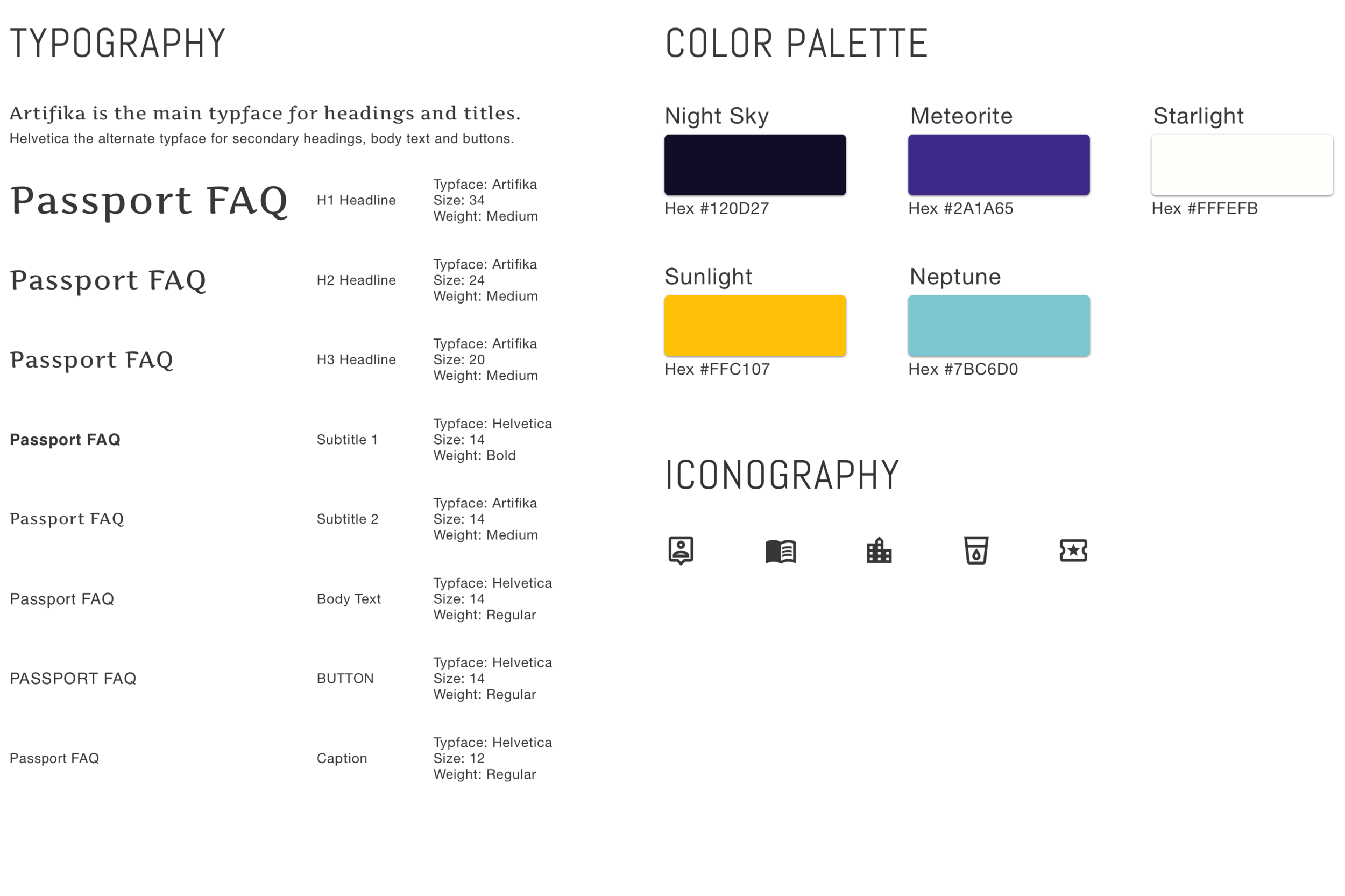
Created site maps, a journey map, a style guide, the slide deck, and a high-fidelity mockup.
Tools Used: Whiteboards, Sketch, Google Forms, Card Sorting and Keynote.

Customer & Manager Interviews
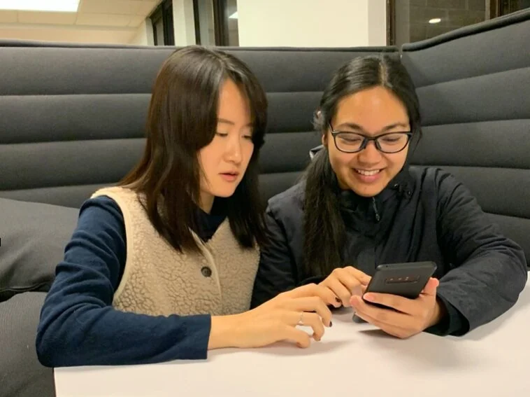
Goal: To observe the customers at McMenamins, interview the customers and employees to determine why either groups have used the app in the past, and learn about their experiences with the app.
Findings:
Customers typically use the application for the McMenamins rewards passport.
The app helps customers track the stamps they have collected in their physical passport.
The rewards passport is a major component of McMenamins’ business, with over 200,000 issued.
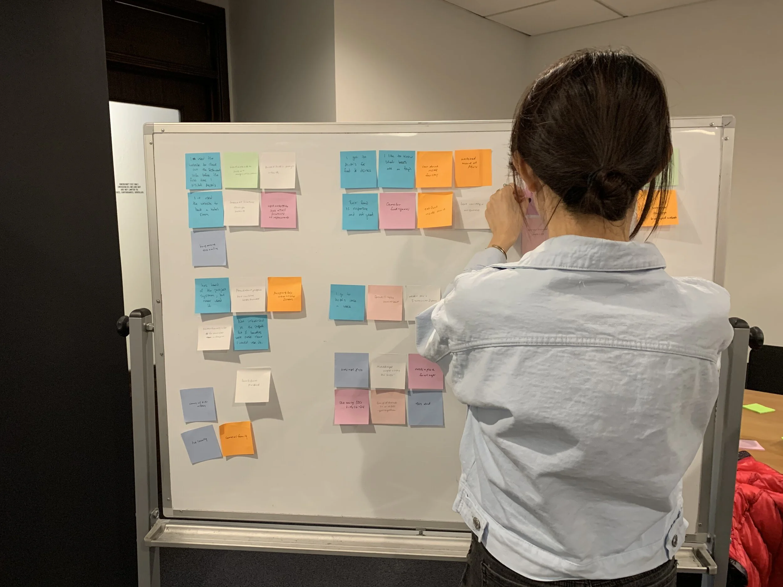
Affinity Mapping
Goal: Organize and consolidate notes from interviews with customers and employees to highlight additional trends that can be used to better understand the goals and needs of the business and customers.
Findings: Common needs and goals for our target McMenamins customers were uncovered and used to create out user persona, and kept in mind throughout the design process.
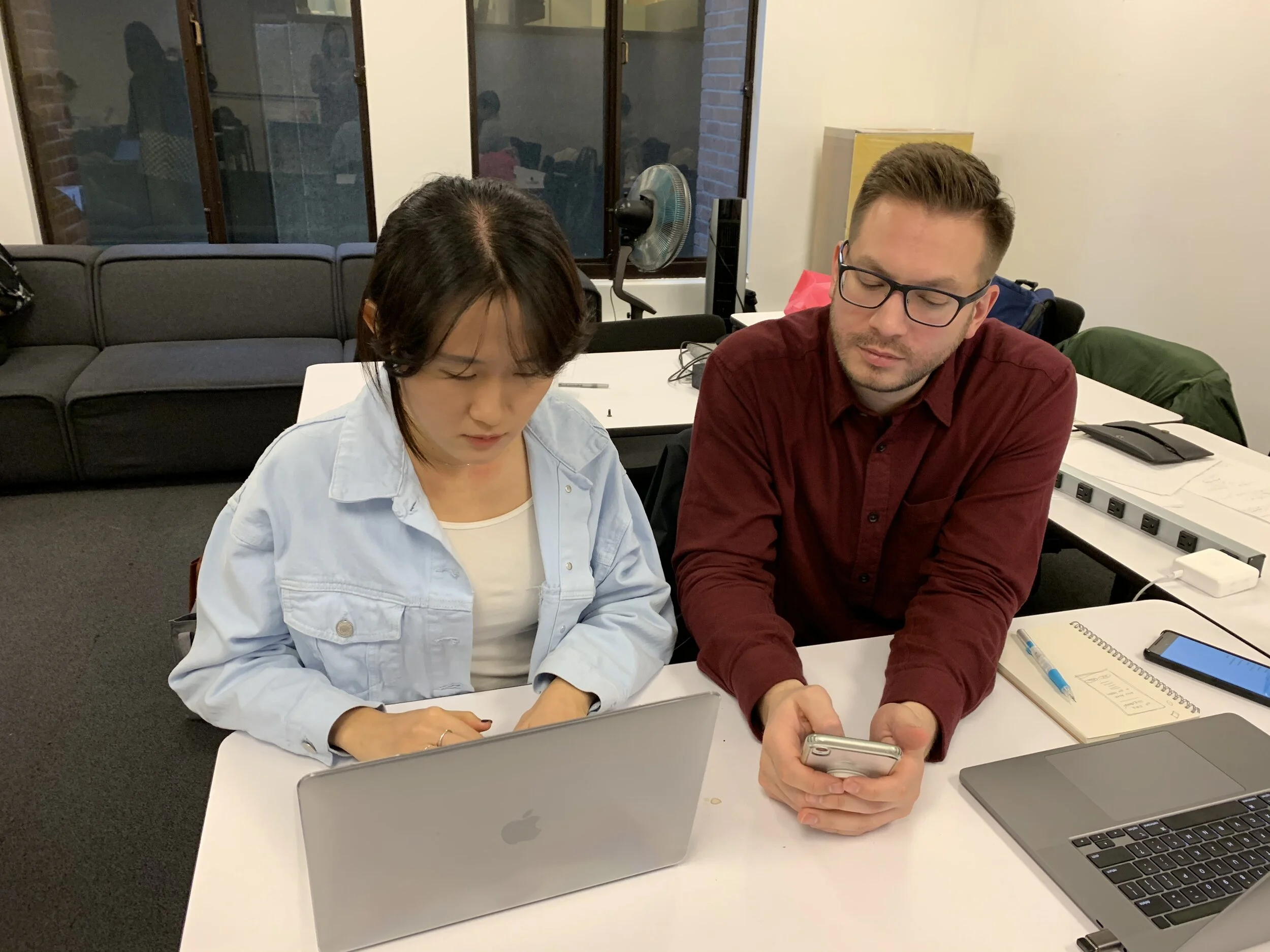
Baseline Usability Testing
Goal: To observe users completing tasks within the original app given a specific scenario, and see how users interact with the app to uncover issues or problems they are experiencing.
Findings: The most common pain-point mentioned amongst the 6 users tested included:
They didn’t see the value or purpose of the passport feature, specifically because:
The passport feature cannot be used in lieu of the physical passport.
The app does not officially save the passport stamps, meaning if the passport is lost or damaged, users must restart from the beginning.
User Persona
Goal: To summarize and represent the goals, needs, experiences, and behaviors of a typical user uncovered during research, so each team member has a clear understanding of our target user when making design decisions.
Result: The target user is a man in the early 30’s, Tim O’Neil, who has a typical PNW career as a software engineer, and:
Is always on the lookout for a new adventure.
Values social life with friends and family.
Cares about efficiency and productivity.
Doesn’t like redundancy or ambiguity.
“I love visiting new cities and checking out the local restaurants and pubs with my girlfriend! We travel a lot, so we are always planning our next adventure, and also looking for deals or travel rewards.”
User Journey Mapping
Goal: To gain insights on how to optimize the customer experience by outlining the journey our persona would take as a customer who used the previous app, experienced the key problem uncovered during research, and used the new version of the app.
Result: Some of key insights our team learned from the creating the journey map include:
Without the new app, there is a chance that users who lose their passport would stop going to McMenamins.
The new app needs to save the stamps, and convey this new feature to new and old users.
Metrics to measure the success of the new app could include tracking the change in passport sales, app store ratings, app downloads, and overall app usage.
There will need to be a marketing campaign to reintroduce the new app.

Comparative Analysis
Goal: To learn from other apps that focus on users going to physical locations to earn unique rewards as they travelled to new locations.
Findings: The major insight our interaction designer learned was that the other apps have an analytics aspect to them, where users can see their overall progress and have access to they recent prizes and recent activity.
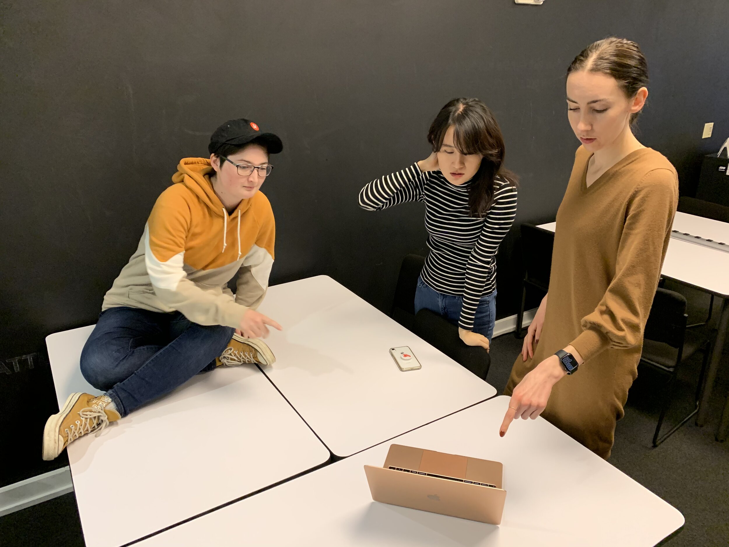
Sketching & Team Brainstorming
Goal: To work as a group to understand the problem we are trying to solve, outline objectives for the solution, make a plan of action to solve the problem, and generate several designs.
Result: Our interaction designer lead the brainstorming session, sketching various screens out, asking for our input, and clarifying any questions about the research findings. The result was a refined set of preliminary sketches taking a variety of our ideas into consideration.
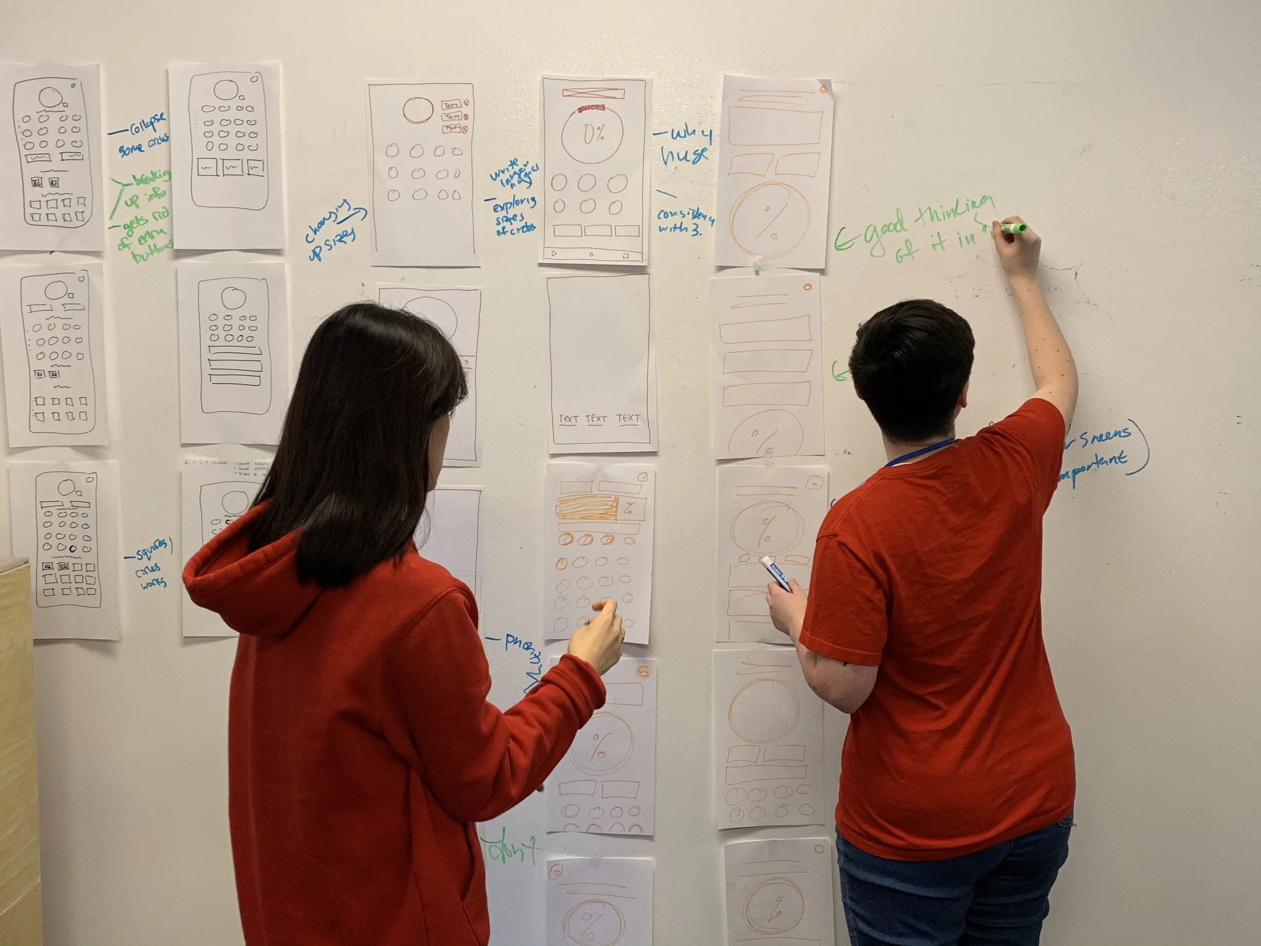
Design Studio
Goal: To solve a specific problem our interaction designer was facing with regards the layout of a screen.
Result: Our team came up with 20+ screen layout designs in a matter of minutes, and we were able to quickly narrow down the best option to proceed with.

Information Architecture
Goal: To restructure and simplify the the primary navigation by understanding people’s mental models through card sorting.
Result: After completing two rounds of card sorting - one round with five participants, and one round with our group members - I was able to pare down the primary navigation from 14 destinations to five main destinations, and reorganize the the site map to incorporate these changes.
Original Site Map
New Site Map
Wireframes & Prototyping
Goal: To create low-fidelity wireframes and prototypes so we can test our designs to gain user feedback early in the process, and rapidly iterate the design.
Result: Our interaction designer was able to iterate the prototype 4 times within a few days of testing and improve the design with user feedback early in the design phase.
Usability Testing
Goal: To improve the usability of the design, and validate our design solution through user testing and user feedback.
Result: We completed four rounds of usability testing with five participants per round, on our low-fidelity prototype, quickly iterating the design and improving the overall usability.
Measuring Performance Metrics
Goal: To obtain System Usability Scale Scores (SUS Scores) from each usability test, and achieve an average SUS Score above 70 by our final iteration.
Result: The average SUS Score started at 24 and increased to 70 by our second round of testing. Our final SUS Score was 78, which is above the minimum acceptable SUS Score of 70.
Visual Design
Goal: To improve the visual design of the existing app to better represent the tone and brand of McMenamins.
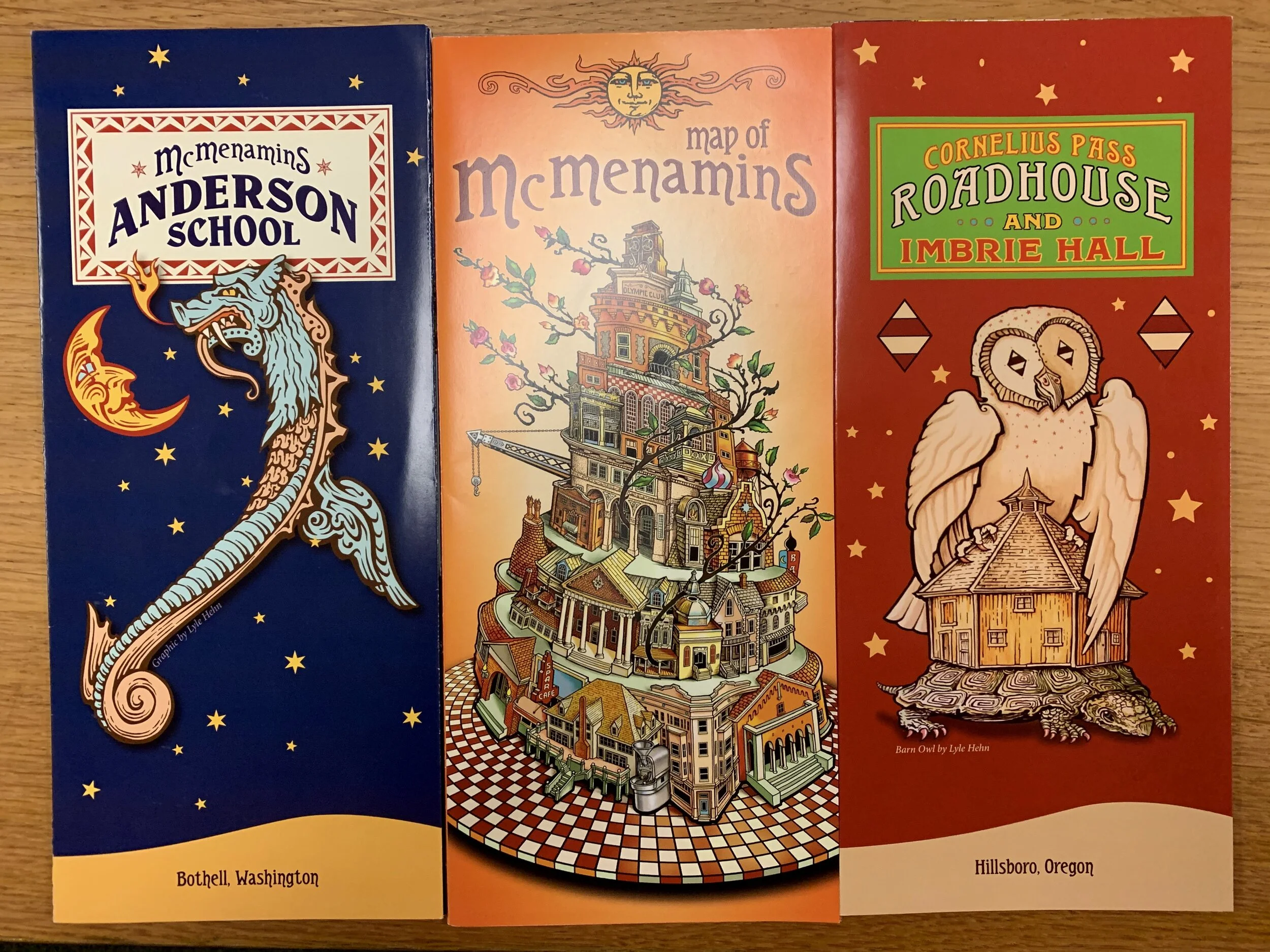
Result: Using existing marketing assets (shown in adjacent image) obtained during our ethnographic research, I used this inspiration to help improve the visual design so it aligns with McMenamins’ common colors and typefaces that compliment their logo and overall brand.
High Fidelity Mockup - Before & After
BEFORE
AFTER
Next Steps
Expand the research scope, and visit additional McMenamins locations to learn more about the customers and business needs more broadly.
Redesign the remaining user flows, and continue to test the design with users.
Build out a high-fidelity prototype and test with users to ensure that the visual design does not impact the usability.
Visit more McMenamins locations and test the design on actual McMenamins customers who are using their passport.
Lessons Learned
Design studios are incredibly useful to quickly resolve a design problem. This helped our team solve a key design issue within less than an hour, and move forward with confidence.
People work at different paces and guessing how quickly others work can be difficult. A project manager should talk with their team about expectations so they can all be aligned on this.
People document their work and decisions differently. Discussing how you document your work, and coming up with a uniform method that you can all agree on is best.
People have different presentation styles, and combining those styles takes time and effort. Planning for this from the beginning would speed up the process and keep teammates aligned.
CREDITS
My high-fidelity mockup includes images found from the original app and website, such as the location coasters, logo and passport stamps. These were not created by me, but borrowed from McMenamins as I believe they contributed to maintaining their brand in the redesign.
Other Projects
Connected-Citizen
Web App Redesign
Black Bottle Gastrotavern
Website Resign


